Image source: https://www.theguardian.com/artanddesign/2015/jul/04/as-byatt-patrick-heron-the-artist-who-helps-me-write (Accessed: 19 October 2025). © The Estate of Patrick Heron/DACS, London
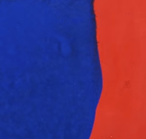
Patrick Heron, Very Soft Yellows and Formal Reds, April 1968 (1968), Harrogate, Mercer Art Gallery, gouache on paper.
There’s a gentle drizzle in the air as I make my way to the Mercer Art Gallery in the historic spa town of Harrogate. It’s the first Saturday of October and the penultimate day of Liz West’s H.A.P.P.Y exhibition, at the heart of which is an installation comprising several hundred brightly coloured reflective discs, arranged across the floor of the gallery’s main space.[1]
Titled Our Colour Reflection, the installation is complemented by a number of smaller studies and works on paper. Colour and light are the overriding themes here, with the exhibition functioning as both a response to West’s experience of Seasonal Affective Disorder and as a celebration of the brighter months,[1] which are still fresh in the memory.
As vibrant as these works are, however, what interests me most is the supporting cast of works which the artist has selected from the gallery’s extensive permanent collection.[1]
Figure 1: https://contemporaryartsociety.org/objects/cajun-1982 (Accessed: 19 October 2025).
The first of these selections to catch my eye is John Hoyland’s Cajun (1982; figure 1). I’d expected this work to be thoroughly upstaged by the Patrick Heron gouache that hangs just across from it, but I’m proven wrong. Its loose brushwork and clashing shapes make for a surprisingly strong image which balances an almost luminous brightness with a brooding undertone.
Figure 2: https://www.flickr.com/photos/30120216@N07/54422394955 (Accessed: 19 October 2025).
The aforementioned Heron gouache is Very Soft Yellows and Formal Reds, April 1968 (figure 2) – an example of the artist’s ‘wobbly hard-edge’ paintings, in which intricate networks of jagged, irregular shapes are infilled with stunning colour.[2] Just like West, Heron placed colour at the heart of his practice;[2] here, subtle distinctions between shallow, tomatoey reds are contrasted by a striking area of deep, solid cobalt blue.
Particularly interesting, as is the case with much of Heron’s work from this period,[2] is the way in which its unusual shapes are pushed to the margins to create a sense of soothing, naturalistic spaciousness.
Figure 3: https://artuk.org/discover/artworks/the-first-of-the-ebb-the-sailor-and-the-sea-10459 (Accessed: 19 October 2025).
Another highlight of West’s selection is Edward Wadsworth’s The First of the Ebb, the Sailor and the Sea (1938; figure 3) – a dazzling, immaculately detailed painting which conjures a surreal atmosphere from a varied range of nautical iconography.
This selection of supporting works forms an interesting and nuanced dialogue with West’s own installation. I also can’t help but admire her audacity in presenting these works before the Harrogate bourgeoisie, who survey the room impassively before retreating to the gift shop.
[1] Müller, A. (2025) A Kaleidoscopic Triumph: Liz West’s H.A.P.P.Y. Available at: https://aestheticamagazine.com/a-kaleidoscopic-triumph-liz-wests-h-a-p-p-y/ (Accessed: 19 October 2025).
[2] Hazlitt Holland-Hibbert (no date) Patrick Heron: The Colour of Colour. Available at: https://hhh.viewingrooms.com/viewing-room/12/?_preview_uid=175fbea29a544613b725a500b333b5d3 (Accessed: 19 October 2025).

Leave a reply to Robin Brown Cancel reply