Image source: https://www.50ansdepubs.com/Pubs/pub.php?p=Banques/CaisseEpargne/1175 (Accessed: 20 February 2026). © Caisse d’Épargne
This French-language press advertisement by Caisse d’Épargne, the French savings bank, appeared in 1971 to promote its SICAV investment scheme. It centres on a striking interpretation of the brand’s logo, first introduced in 1950 and known simply as l’écureil (the squirrel) – an animal whose seasonal practice of collecting and storing food had presented the brand with an ideal metaphor for its values of thriftiness and foresight.[1]
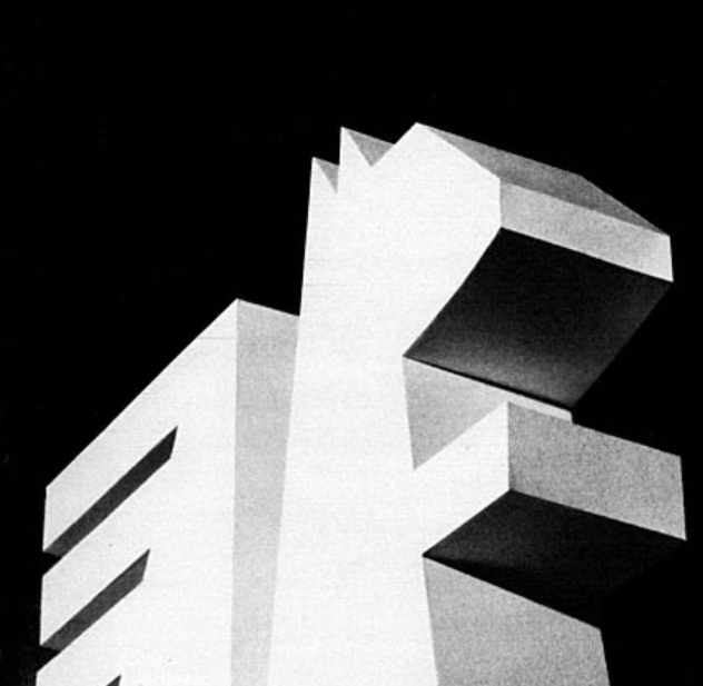
Early incarnations of l’écureil were highly figurative, but a new logo, introduced in 1968[1] and seen in negative white in the bottom-right of this advertisement, marked a striking departure. The organic shapes and realistic details of earlier iterations were stylised into a reassuring symmetry of straight lines and concentrated forms,[1] resulting in the brand’s first truly modern identity.
In this advertisement, the hard-edged angularity of this new logo allows for its own transformation into a three-dimensional, brutalist monument to prescience and frugality. Viewed from a low angle – implying its monolithic scale – and illuminated by a bright light from the left, it stretches skyward in a manner reflective of an urbanised, industrial society.
Here, the spry, upright stance of the brand’s logo is married to a sense of depth which endows l’écureil with a certain solidity, underlining the product’s ‘dynamic and safe’ (dynamique et sûr) credentials. In addition, the monolithic écureuil faces right, rather than left, implying a forward-looking perspective.
In the bottom-right of the advertisement, the monolithic écureuil is mirrored by its two-dimensional equivalent, thereby fusing the brand’s future-oriented outlook with a commitment to its established principles. Of final note is the single column of lowercase text which uses a crisp, sans-serif typeface, furthering the advertisement’s distinctly modern visual appeal.
The visual identity of Caisse d’Épargne would undergo numerous changes over the coming decades, culminating in a highly economical logo which pared down the form of l’écureil into a minimalist configuration of lines.[1] Although undoubtedly striking, the legibility of this logo relied heavily on existing brand awareness – a fact which was addressed when it was revised in 2021, three decades after its introduction.[1]
[1] Association pour l’Historie Caisse d’Épargne (no date) À la decouverte de l’écureil. Available at: https://www.histoire.caisse-epargne.fr/en-images/a-la-decouverte-de-lecureuil/levolution-du-logo/ (Accessed: 20 February 2026).

Leave a comment