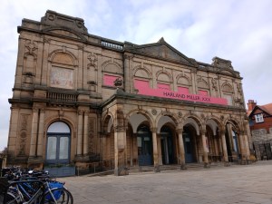
Currently on display at York Art Gallery is an exhibition of recent works by York-based artist and writer, Harland Miller. Spread across three spacious galleries, the exhibition brings together a diverse and extensive selection of works from his ‘Letter Paintings’ series,[1] in which the individual letters of short words are overlaid to form striking visualisations of everyday language, offering colourful, hard-edged precision on a monumental scale.
The exhibition also includes smaller works on paper which often echo the configurations of the larger paintings. Drawing attention to Miller’s compositional process through their somewhat loose, splattery execution, these works are occasionally displayed alongside their large-scale equivalents, allowing the viewer to compare the results of their differing approaches.
Figure 1: https://www.yorkpress.co.uk/resources/images/19089273/?type=mds-article-620 from https://www.yorkpress.co.uk/news/24935220.harland-miller-brings-new-xxx-show-york-art-gallery/ (Accessed: 20 December 2025).
If (figure 1), with its humming oranges, gets things off to a strong start. In the context of Miller’s letter paintings, this one is unusual in two regards – firstly in the fact that it overlays a whole word on top of itself, and secondly in its omission of the ‘neutral band’ which, in other paintings in the series, announces the title of the work alongside Miller’s own name.[1] If, however, sets the tone perfectly for what follows, suggesting a world of typographic possibilities and intense colour.
Figure 2: https://www.yorkartgallery.org.uk/wp-content/uploads/sites/5/2025/03/YMT12-3-25-146.jpg from https://www.yorkartgallery.org.uk/exhibition/harland-miller-xxx/ (Accessed: 20 December 2025).
Miller’s letter paintings take inspiration from both the laborious accuracy of medieval manuscripts[1] and the way in which a motorway sign appears surprisingly large when viewed from a static, close-up position (as opposed to being viewed from a distance and at speed).[2] These paintings generate a remarkably similar feeling; within the confines of the gallery, the awe-inspiring effect of their unusually large scale is inescapable.
Figure 3: https://www.yorkpress.co.uk/resources/images/19200650/?type=mds-article-620 from https://www.gazetteherald.co.uk/news/25004477.xxx-art-show-harland-miller-opens-york-art-gallery/ (Accessed: 20 December 2025).
Some of these paintings, such as So (figure 2), deal in loud, clashing colours, while others, such as Numb (figure 3), feature complementary hues, with the most inventive and unexpected uses of colour often reserved for the areas where the letters overlap. Typically, these colour combinations are reproduced at the bottom of the painting as a series of vertical drips; the result is reminiscent of the edge of a peeling billboard, giving the impression that the image has been pasted over another.
Figure 4: https://www.whitecube.com/artworks/far-out (Accessed: 20 December 2025).
Figure 5: https://www.instagram.com/phaidonpress/p/DHMAgClxSXC/?img_index=4 (Accessed: 20 December 2025).
In many of his letter paintings, Miller’s choices of typeface and colour refer to meanings and ideas associated with the words they represent. Far Out, for example (figure 4), uses a distinctly 1970s-inspired typeface which befits its dated turn of phrase, while Nude (figure 5) is a playful reference to media censorship, with its fleshy tones married to a typeface which is pixelated to near-abstraction. Other works, such as Star (figure 1) and Loop, denote the literal meanings of the words they depict.
Although the potential scope of the series is undeniably finite, there is no evidence of Miller having to tread the same ground twice. Each configuration displays a fresh approach, and his creativity is just as apparent in his smaller works on paper as in his large works on canvas.
Figure 6: https://www.kingandmcgaw.com/prints/harland-miller/win-473062#473062::frame:880610_glass:770006_media:0_mount:108654_mount-width:20 (Accessed: 20 December 2025).
The dayglo colours and pixelated typeface of Win (figure 6) call to mind the dopamine rush of a retro video game, while the purples, toxic greens, deep blues, and rounded typeface of Moon conjure up images of intergalactic travel and extraterrestrial encounters. The vivid, citrus colours of Mojo suggest a sense of renewal and revitalisation, while the grayscale letters of Eerie are stacked, rather than overlaid.
Much of the appeal of Miller’s letter paintings lies in dissecting their disorientating compounds of edges and curves until their titles reveal themselves. In a world which is overloaded with imagery, much of which is often only given a cursory glance, these works command the viewer’s attention in a deliberate and highly focused way.
Figure 7: https://apollo-magazine.com/harland-miller-design-museum-london-preview/ (Accessed: 20 December 2025).
The ludic appeal of these works is particularly apparent in Oh No (figure 7). This painting dominates a large wall at the far end of the exhibition, with the audaciousness of its sheer size invoking impressed chuckles from visitors as they approach it. As well as being by far the largest work in the exhibition, it is also among the most inventive – its two ‘o’s are placed in the foreground, with the adjacent ‘h’ and ‘n’ placed closely together behind them, creating an unusual sense of depth.
In this painting, Miller marries bright, artificial colours to a hefty typeface, with the parallel lines of its italicised letters forming a series of positive correlations; the resulting configuration has the striking immediacy of a billboard advertisement. Here, the most banal of expressions is transformed into something which, like many of Miller’s other letter paintings, is bold, colourful, fun, and surprisingly clever.
[1] York Museums Trust (2025) Harland Miller: XXX. Available at: https://www.yorkmuseumstrust.org.uk/news-media/latest-news/harland-miller-xxx/ (Accessed: 20 December 2025).
[2] Harland Miller: XXX (2025). [Exhibition]. York Art Gallery. 14 March-31 August.

Leave a comment